Wednesday, April 28, 2010
Surrealism" Up in the Sky"

Panning and Blowout


For the blowout picture I had to have the shutter speed open the ISO on and aperture. The shutter speed had to be left open to allow all that light in. I do think this is the best way because it makes the person stand out and takes out the background. Another way is probably taking a picture and just using photoshop.
Tuesday, April 27, 2010
Shutter Speed

In order to get pictures to come out looking like this the setting of the room has to be dark and each person holding a light. The shutter in the camera is the amount of light let into the picture. to get this picture your camera has to be on manual. Depending if you leave your shutter speed open for a long time then alot of light will go in. To do letters or movements you move your lightin the same direction for 15 seconds. I would choose ISO better because you can create unique stuff on your pictures.
Aperture

Aperture is when the hole can either open big or small.In the top picture of the red flower, the flower comes out clearly because the hole is small making everything else the background blurry and just focus on the camera. The bottom picture has the hole big letting everything come out and not be blurry. This would be good when you take picture of landscapes.Thursday, April 22, 2010
ISO


ISO 400Flash

Metering

A light meter what it does is in the camera how you see a box in the middle of your screen in there all the light knows to be in there so focus your camera to a light light then switch it to a dark spot and your picture will come out dark or bright. in one of the pictures the light is focusing me on the computer screen that you cant see nothing besides the screen the other picture was out on the persons face were there was more light and it focused more on the person then on the screen. It can help in the future by focusing on your emphasis and make it stand out more.Friday, March 19, 2010
Surreal Practice Tutorials


In the desert tutorial we combined the dirt into one big picture. Then we distorted which made the mud look closer and further away from us. We then got a paint brush that was a cloud. then got a light pole and changed the levels to it to make it blend in with the picture. Then we added a shadow in back of the light stand to make it look like the sun is hitting it. by doing both of this tutorials I believe that it will help me on my surreal project by helping me blend in pictures with one another and making the pictures feel real and dreamy now I would be able to make my art work look realistic and I can add reflections and shadows to the pictures.
Tuesday, March 16, 2010
Surprise
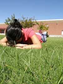
I was given the task to take a unique picture. That would surprise my teacher when looking at it. I feel that you don’t really see pictures of people laying on the grass and capturing a picture of a person with the view of the background. My picture was trying to express peace and a sight view of nature.
I like this picture because it has a different feeling to it when you see it. Also I like the angle that I took the picture when you can see everything clearly. The sky looks very blue with no clouds, and the grass is what catches your attention right away.
Monday, March 1, 2010
Graduation
The strength in my design was the picture in my back cover were It looks like the Pegasus is shinning the rays. i could of done my front cover different by maybe not putting the quote and the diploma and the cap all together like it was to much in one place. It was a little bit more hard because i actually had to think of something to do, and it had to be just pictures that i took and i had to come up with an idea with a short period of time. the important aspics are the background and the fonts and the pictures that are on the covers that they all blend in and the colors go good together. Making invitation's or posters or billboards, or special occasion'sSi Se Puede/ Academic Letters

Monday, February 1, 2010
Personal Quilt


INSIDE
PAST
At the beginning starting this project was hard for me. To think of ideas but as i started getting pictures and putting them on my quilts ideas started popping in my head.My favorite quilt is My Past because i tried to show what was in my past by me moving from El paso to phoenix and the drastic change i went threw and it was hard leaving my family behind. Doing the quilts helped me learn more about myself what is really important in my life to me. My least favorite was the Outside quilt because i didn't have an idea how to put my pictures together. The look i was heading for was a collage. In my future quilt i like how my eyes pop out on top of the picture and how I'm floating in the sky.My inside was my second favorite because my family means the world to me and showing them in my pictures was something cool.Thursday, December 10, 2009
Artist Statement
1. In digital photography i have kept a portfolio. The portfolio contains many assigned pictures that I had to take and within the process of taking this pictures I learned new compositional tricks and after every picture I answered some questions and gave my thoughts about why I had taken that certain picture.
2. Viewing my portfolio you come across many pictures that I have taken. In the pictures are tech incs that I have learned from being in digital photography my pictures aren't just random pictures that I have take. They have leading lines, different saturation's,macro, and mainly compositions that I never knew. I feel that my portfolio is excellent because I have been keeping up with it and its away of expressing what I feel about the picture so it makes more unique. I feel that I was more successful with working in photo shop because some stuff I already knew and it was fun and cool to change a picture and make it look better then how it started. What I struggles the most with was finding stuff to take pictures of because on the campus there was nothing to take a picture of and also because I knew what i wanted to take a picture of but I would struggle for it to come out like I wanted it too. I have learned this semester how to take good picture and what to look out for and what to focus on. before I would just snap a picture but now I actually take my time so that my picture looks good. I could improve on practicing using the tools more and remembering the steps to edit a picture and add cool effects too it.
3. Photo shop really improves a picture and makes it look twice better. I really enjoy working with it and learning new stuff and the different pictures we took are pictures that I would of never thought about taking something different.
Wednesday, November 25, 2009
Personal words
The lyrics i chose for this project are "Daddys little girl" by Tim McgrawFriday, November 13, 2009
Social Issue:" Trying To FIt In"

- In the picture you see black outlined gray puzzle pieces stuck together with a unique white polka dot lined puzzle, different from the others. Above and below the unique puzzle piece there is words in red with a black background standing out so the viewer could see the message the photographer is trying to say. The words are " Everyone Needs Comformity"
- The social issue was trying to fit in, many people hang out with a crowd of people that may be popular or are using drugs and that certain person feels that they are obligated to do what their peers are doing just so they could like them. In the picture all the black outline gray puzzle pieces represent a group of friends, and the white polka dot lined piece is that one person trying to fit in with the rest of them doing what they are doing, but this one is different because it wants to be just like the black outlined gray pieces. The words "Everyone Needs Comformity" go with the picture by saying everyone at some point has to try to fit in with others, and by doing this they feel secure and makes them feel better inside. This has effected me before because i have had friends that tried fitting in with other people and at the end they just ended up hurt which i have done this before also trying to fit in with a group of bad people that just lead me to no good.
Tuesday, October 27, 2009
Scary Effects


My favorite was the vampire because of all the effects that we added to it made it look cool.Some of the tools i learned was from the paintbrush to add broken glass stuff and then pen tool to make cure lines. the difficult stuff were at the begining getting used to the pen making it curve.Also the clone tool. I think i did well on the blending stuff into the picture and making it look realistic. some jobs may be like on halloween, to make scary people or post pictures that look freaky and scare people. or maybe even on scary moives. photoshop to fix the pictures and add effects to them.
Tuesday, October 13, 2009
Critique: Robert& Shana ParkeHarrison

There is a man kneeling down with a stack of wood in his back and a hammer in his hand he is building his own path by the wood he has in his back. It’s a simple picture that has a leading line which is the wood that leads you to him showing you what he is doing. The meaning of the picture that I get is a hard worker determined to finish his task. It seems like he is trying to make his way through the water.
Thursday, October 1, 2009
Photographic Effects


My favorite trick was the blow out ,becasue it brought out the picture and the colors looked awesome. I would want to work with adjustment layers becasue it gives the picture more value and makes the pictures look better and has and you can see alot of shadows in the pictures.the things that i liked that i discovered were the saturation and the contrast . Monday, September 21, 2009
Portrait
the portrait that i thought i was succesful with was the surprise because i used macro and the leave brings out the picture.
Tuesday, September 15, 2009
Contact sheetMy favorite compostional trick was extreme angles, because the picture stands out more and you get to see the object from a different angle.
The tricks that i would use would be framing because it helps bring out the object. Extreme angles to see the object at a differnent view and makes the picture more artistic.
My least favorite trick was fill in flash i couldnt get the pictures to be dark and light it was to difficult. My favorite picture that i took was simplicity cause the colors of the plant and the plant was pretty the background made the colors of the plant stick out more.
Friday, September 4, 2009
Compostional Trick #8 FIll in Flash

Fill in flash i had trouble with. i understood that you had to take a picture without flash and had to be in dark or have shadows covering your object and your picture would come out dark and hard too see. The other one was staying in the same position but adding flash to it and this would brighten your object and you will be able to see it. Compostional Trick #7 Drawing with Light
Compostional Trick #6 Framing
Compostional Trick #5 Extreme Angles
Compostional Trick #4 Simplicity
Wednesday, August 26, 2009
Compostional Trick#3 Macro
Compositional Trick#2 Leading Lines